 Signature gradient
FPE design system.
Brand, components and motion for interfaces built with shadcn/ui, React and the open web.

Made to work together.
Existing components. A more distinct visual language.
A real interface, not an illustration.
Identity.
The original monogram, with gradients as a deliberate brand treatment.
Signature gradientWhite on black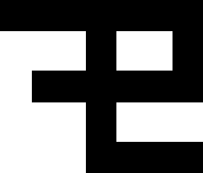 Black on white
Color
Gradient-led fuchsia for the brand. Black and white for the interface.
SignatureFuchsia / violet
DepthFuchsia / black
Black#000000
White#FFFFFF
Typography
Aa.IBM Plex Sans
IBM Plex Mono
0123456789
IBM Plex Mono
0123456789
IBM Plex Sans and Mono. A deliberate scale, readable leading and restrained tracking.
Components.
Established shadcn primitives, with FPE styling. The following are native HTML specimens.
Actions
Try the interaction.
Inputs
States
New releaseIn reviewArchived
State is conveyed through text, shape and contrast, never through color alone.
Motion.
Responsive interactions, intelligible transitions and selective brand expression.
Interaction160 ms · ease-out
Transition380 ms · emphasized
Brand expression720 ms · expressive
Demonstrations respect reduced-motion settings.
Installation.
Apply the theme to your existing shadcn project. Branded blocks are optional.
FPE theme
npx shadcn@latest add ogfrench/fpe-design-system/fpe-themeReview the registry changes before installing. Available after the first approved release.
FPE hero
npx shadcn@latest add ogfrench/fpe-design-system/fpe-heroOptional brand composition. Native shadcn controls stay in charge of behavior.